 |
| Laurent listening to the voices in his head. They are talking about monkeys. In fact, the voices ARE of monkey origin. |
|
|
 |
| What Laurent looks like when the monkey voices tell him to do a cover titled in Comic Sans. |
Lovely lovely Laurent Linn says the cover of your book can make or break it. And the important voices that decide what a final cover will look like are:
- The author
- The editor
- The sales and marketing team (they are your friends!)
- The publisher
- The art director, in this case, Laurent Linn
- The voices in Laurent's head
First cover evolution story:
Lottie Paris Lives Here
by Angela Johnson, illustrated by Scott Fisher, publishing in a few months.
One of Scott's first cover sketches:
Not only is this cover for the first book, but for establishing what may potentially be the branding of an entire series. The character is important, but so is the setting and some of the props and the question was whether to have all of these non-main character elements on the front cover, or wrapping around from the spine onto the back, or anywhere near the cover. This sketch has elements of props and Lottie's house, and the VOICES decide it should just be Lottie interacting with the type. So Laurent asks Scott for something different.
One of Scott's character-focused cover sketches with type interaction:
Laurent likes this, but rather than explain the tweaks he wants, he can just mock something up in Photoshop and show Scott. Laurent asks Scott to do tons of posture and pose sketches of Lottie. Scott did! And the mock-up below is based on pose #18 from a group of 25 and Laurent's Photoshop mock-up:
Laurent says be prepared to go through all of these sorts of iterations to get to:
Second cover evolution story:
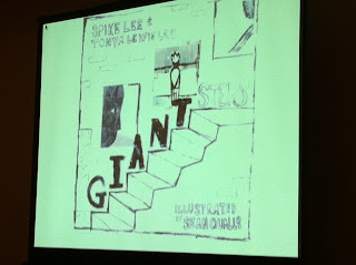
by Spike Lee and Tonya Lewis Lee, illustrated by the totally amazing Sean Qualls
Laurent likes to give the manuscript to the illustrator and ask "What's your idea for the cover?" before directing them on what Laurent (or his inner monkey voices) might have in mind. Here's a quickie version of the sketch-to-final with the captions as Laurent's (OR MAYBE IT WAS THE MONKEYS TALKING) take on what was or wasn't working for the cover sketch.
 |
| Lovely but Sad |
 |
| Too sophisticated |
 |
| Could be taken too literally, those are some big [damn] steps |
 |
| Final painting, but not quite working, Laurent loves the lettering |
 |
| Laurent plays with it in photoshop |
 |
| Sean's final painting |
Ooo, now we are seeing the evolution of THE DAGGER QUICK cover by Amy June Bates, which is a middle grade cover. IS IT A COINCIDENCE THAT THERE IS A MONKEY ON THE COVER?
Laurent and his monkey voices says illustrators should STRONGLY PONDER doing illustration work that would fit for middle grade books. Shove some black and white spots and a color cover in your portfolio, yo.
Spots of monkeys.
- Fun fact about Laurent: He doesn't play with cover type too much until the final art is in so he can be inspired by it.
- Fun fact about Laurent's inner monkey voices: They can sing any Gilbert & Sullivan song in up to four-part harmony.
OH, my goodness. The art for Scott Gustafson's EDDIE is crazy amazeballs.
And then
I started hearing monkey voices when I saw a sneak peek of the art for a teen retelling of PINOCCHIO. These photos do NOT do the three cover sketches justice.
Laurent wanted some of the above elements combined and then asked the illustrator to leave room for the title and this is the final.
CHECK OUT THOSE FRICKING WOLVES, man! So good. Who is this illustrator? My newly acquired inner monkey voices were shouting about bananas so I missed hearing the name.
Now it's getting juicy, Laurent is talking about making a cover for a book about undertakers and souls and watches (no monkeys.) Wish you were here to hear!


