 |
| Isabel Warren-Lynch speaking at her "What Hooks Me" Session |
Isabel Warren-Lynch has worked in children's books since 1980 starting as a designer at E.P. Dutton where she passed by the original Winnie-the-Pooh in the lobby every day. In 1985 she was introduced to mass market formats and became the Art Director at Grosset & Dunlap. In 1991 she returned to trade publishing at Random House as the Art Director for Crown Books for Young Readers. Her job has grown over the last 20 years and she now oversees a group of 11 designers work on over 300 books a year on the Random House imprints including Knopf, Delacorte, Wendy Lamb Books, Ember, Bluefire and Dragonfly. As Executive Art Director, she has worked with the best editors and some of the most exciting authors and illustrators in the business.
Isabel wants us to consider emotional connection through illustration.
When you're going through portfolio after portfolio, there has to be some emotional connection to pull you in.
She's showing us some images that grabbed her early on - among them Garth Williams (like the ones for Charlotte's Web) and E. H. Shepards' "Winnie The Pooh" and Maurice Sendack ("Higglety Pigglety Pop! or there must be more to life") - and unpacking how each composition lets us know what the story is about at heart.
 |
| How he could take two of the ugliest animals "...but the love you see there." |
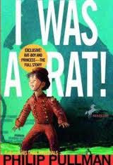
And now she's sharing what's new that she LOVES. Among the examples are "I Was A Rat" by Philip Pullman, a MG illustrated by Kevin Hawks,
 |
| How something could be sweet and funny and sad all at the same time... |
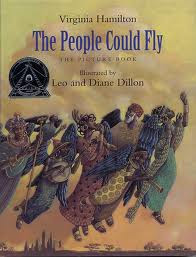
and Leo and Diane Dillon's ilustrations of "The People Could Fly" by Virginia Hamilton.
 |
| How the composition is like dance |
She's discussing subtleties of expressions, foreshadowing, interactions between characters, body language and position, hair, clothes, movements, muscles, shapes, economy of line...
She worked on Barack Obama's Of Thee I Sing: A Letter To My Daughters, illustrated by Loren Long, and tells us the story behind that book and its remarkable illustrations.
 |
| An interior spread |
Isabel discusses how to best present your work as an illustrator (she's sharing that last night at the portfolio review she collected many dozens of postcards!) She's holding up examples of smart promotion and explaining why she liked them. She's also talking about how book dummies reveal your understanding of pacing and layout, answering if you can you carry through a story and characters.
Some Advice:
Before you submit, visit the publishers' websites and look at their books - and ask yourself, could I see my illustration style sitting next to their books?
There's an eager Q&A, and from that this comment that summed up Isabel's session nicely:
"It can be beautiful beautiful beautiful... but we're visual storytellers. It has to tell a story."
Thanks, Isabel!

I found this talk to be one of the most deeply effecting moments of the entire weekend. I had a bit of an epiphany after this talk about my own illustration work. I tend to focus heavily on making it "beautiful"- but as was said in the summation "it has to tell a story". The examples of the line drawings from Charlotte's Webb which so perfectly convey the deep emotional connections between characters really brought this point home for me. Thank You for such a great talk!
ReplyDelete