One of the best, if not the best, picturebook dummy critiques I ever received was from editor Justin Chanda. And BECAUSE it was so fantastic, I felt compelled to attend this session and blog about it for all of you who are not able to be here. Here in this cold, dark Hyatt basement instead of working on my tan/having a Blue Hawaiian poolside.
So here is How Chanda Revises.
A picture book is an Experience. Long before e-books, picture books were the first interactive book, a well done spread of image and text physically compels you to turn the page. "The page turn is key."
Though a picture book IS marriage of word and picture, at the end of the day, it's a picture book, the pictures are very, very important, the best picture books are the ones where the words are making the pictures better and vice versa.
He looks for:
Short, young, funny text. The market trends for picture books are for five- to six-year-olds.
Economy of text. "If you think you can cut a word, you can cut two. If you think you can cut a sentence, you can cut two. If you think you can cut a paragraph—trick question! You should not have paragraphs in a picturebook manuscript."
A good sign after reading a manuscript is saying, wow, that was satisfying to read. Now I want to reread it. If you want to reread it 100,000 times, that's the stuff classic picture books are made of.
"Rhyming. Your picture book can rhyme. Good. But for every one book that uses rhyme successfully, I can show you fifteen that don't."
The MOST important thing you can do while working on your picture book is to READ IT OUT LOUD.
The first thing Justin does when working on an acquired picturebook manuscript is paginate it. Pagination shows you unequal distribution of text, lets you set up awesome punchlines, and helps you start envisioning things as picture book spreads (which is how you should be looking at it.)
These are not the spreads he's talking about.
But this is.
And by paginating, you can see if there's way too much action on a page making it impossible to illustrate (too much action is different than too much text but often correlates).
WRITERS, make sure you leave something for your illustrators to illustrate. We don't need you to write in the color of the sky.
ILLUSTRATORS, make sure you are not simply illustrating what the author wrote.
What to do with art notes? It's great you are thinking visually! Obviously include them if they're setting up a joke that's the opposite of what the text is saying, but don't be sad when your editor doesn't send them on to the artist.
And now I will let the rest of Justin's tips stay with the conference-goers, but I will tell you he's showing the editorial process behind ROBOT ZOT!
and CREEPY CARROTS!
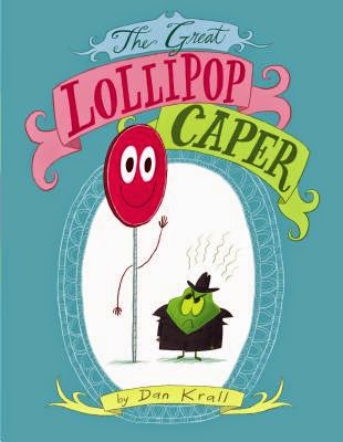
and THE GREAT LOLLIPOP CAPER
and more!!!!


No comments:
Post a Comment